

Introduction
When hosting an event, program, training, or similar activity, these icons can be used on marketing materials to identify the areas of wellness most closely represented by the content. Consider the main focus and goals of the event being promoted and choose the dimensions that most closely align.
We recommend no more than 2 icons per event/promotion. If your activity addresses all eight dimensions of wellness, use the full wheel.
The guidelines below will provide information on how to use the wheel and these icons to adhere to brand standards.
If you have a question that is not answered by the information on this page, reach out to the Well-Being Collective using their online contact form.
Colors
The colors for the personal wellness dimensions are listed below. These colors should not be altered.
Reminder, RGB colors are used for digital graphics and CMYK should be used for print.

Emotional
Hex: F7931F
RGB: 247, 147, 31
CMYK: 0, 50.39, 99.22, 0

Environmental
HEX: 10655F
RGB: 16, 101, 95
CMYK: 88.28, 40.63, 60.16, 24.22

Financial
Hex: D65868
RGB: 214, 88, 104
CMYK: 12.5, 80.08, 49.22, 0.39

Intellectual
Hex: BA2033
RGB: 186, 32, 57
CMYK: 18.75, 100, 85.16, 8.98

Occupational
Hex: 78B743
RGB: 120, 183, 67
CMYK: 58.59, 5.47, 100, 0
Physical
Hex: F15929
RGB: 241, 89, 41
CMYK, 0, 80.47, 94.92, 0

Social
Hex: 866080
RGB: 134, 96, 128
CMYK: 50.78, 67.97, 30.47, 7.03

Spiritual
Hex: 1191C0
RGB: 17, 145, 192
CMYK: 79.69, 29.3, 10.94, 0
Font
The typeface used on the Well-Being Wheel is Montserrat. Montserrat is the University’s preferred typeface for all marketing and communication materials.
Usage Guidelines
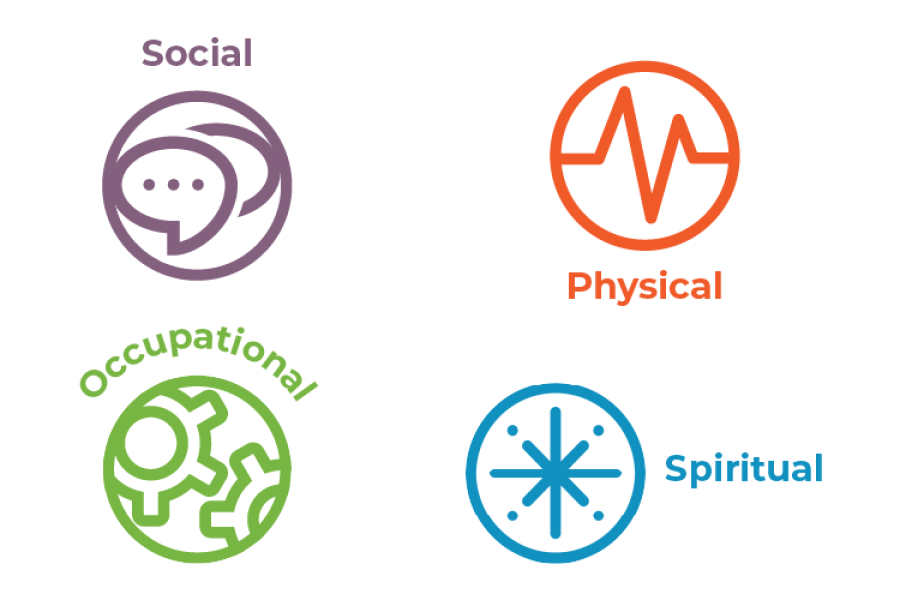
Consider the main focus and goals of the event being promoted and choose the dimensions that most closely align.
We recommend no more than 2 icons per event / promotion.
Add the dimension label above, below, or beside the icons when being used without the full wheel.
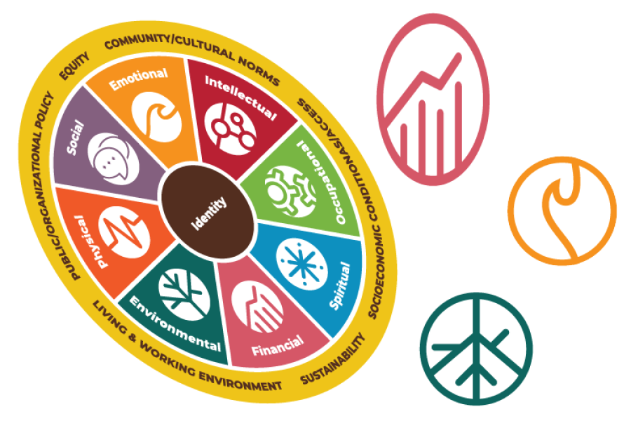
Do not distort the proportions of the wheel or icons.
When changing the size of icons, use the corners rather than the edges to prevent distortion of the graphics.
Do not rotate or flip the wheel or icons.
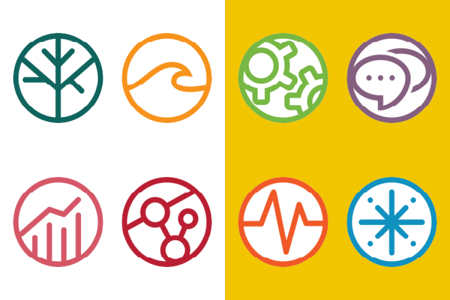
Standard Icons should be used on white / light backgrounds.
These icons have the main color of the icon around the outer edge.
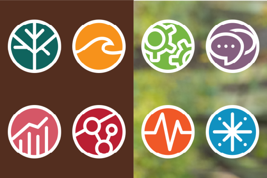
Inverse Icons should be used on dark / busy backgrounds.
These icons have white around the outer edge.
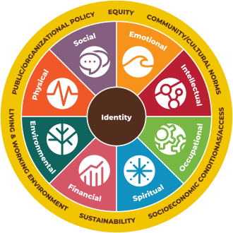
Use your judgement: the full wheel should only be used if it will be displayed large enough for all text to be legible.
Digital Resources: Alt Text
When using these assets in digital resources, be sure to include proper alt text for digital accessibility.
Full Wheel Alt Text: "A circle with three sections of the areas of well-being. The very middle of the circle is your identity. Surrounding that are the eight dimensions of wellness: social, emotional, intellectual, occupational, spiritual, financial, environmental, and physical. The outer ring contains outside factors that impact wellness: public/organizational policy, equity, community/cultural norms, living and working environment, sustainability, and socioeconomic conditions/access."
Icon alt text: Indicate which icon is being used and label it as such. Example: "Emotional wellness icon."
Assets
If you would like to use the Well-being Wheel and icon assets, email @email to request access.