Digital Strategy
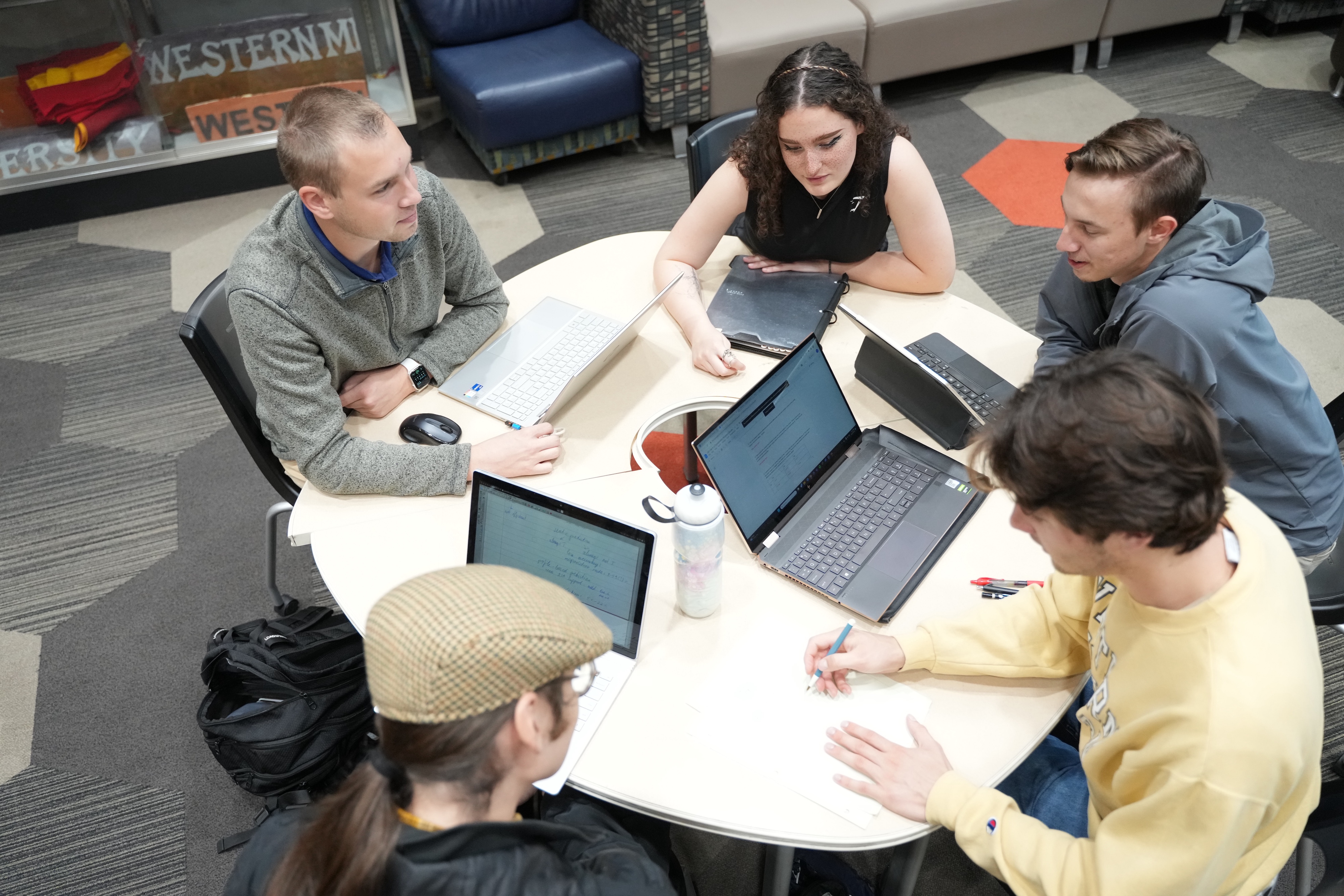
WMU MarCom's Digital Strategy Team empowers the University to build meaningful connections with audiences across digital channels.
We bring together technology, data and strategy to elevate the Western Michigan University brand. We focus on continuously improving how we show up across the website, advertising, social media, email and SMS, adapting as those channels evolve.
Ready to think strategically about your digital presence? Let's talk.
Working with the Digital Strategy Team
Our work spans a few different disciplines, connecting with creative, strategic communications and other MarCom teams to strengthen WMU's digital presence.
WMU website development and support
The Digital Strategy Team oversees the design, architecture, development and security of WMU's content management system (CMS), setting the standards and best practices that keep the University's web presence effective, consistent and accessible.
We're here to help our web users succeed, offering training, technical support and resources like our CMS User Guide. Our developers work across front and backend development, and our team leads WMU's approach to SEO, AI search visibility and website analytics.
Not sure where to start? The CMS User Guide is a good first stop.
How we support the digital ecosystem
Beyond web development, our team works across a range of digital disciplines to strengthen WMU's online presence.
- Search and AI visibility: We lead WMU's approach to search engine optimization (SEO), answer engine optimization (AEO) and generative engine optimization (GEO), ensuring the University is well-represented across traditional and AI-powered search. We also evaluate and advise on web content to keep WMU's digital presence consistent and effective.
- Analytics and reporting: We manage Google Analytics access and reporting, using data to inform decisions across WMU's digital channels.
- Digital advertising and paid media: We develop paid media strategy and work with media partners to connect WMU with key audiences through targeted digital advertising.
- Email and SMS: We advise on the strategy and user experience of WMU's main mass email and SMS platform, serving as a bridge between campus communicators and the technical team who manages our tool.
Explore WMU MarCom
Brand strategy
Through a unified approach to messaging and visual identity, we align marketing efforts across campus.

News and communications
We create and spotlight stories about the achievements, challenges and diverse voices of Western Michigan University.