A flexible page is comprised of regions into which you will add many components. Read further to learn about the regions available on a flexible page. Then continue on for a listing of all the available components and click on the name of a component type to learn more about that component and see examples.
Regions
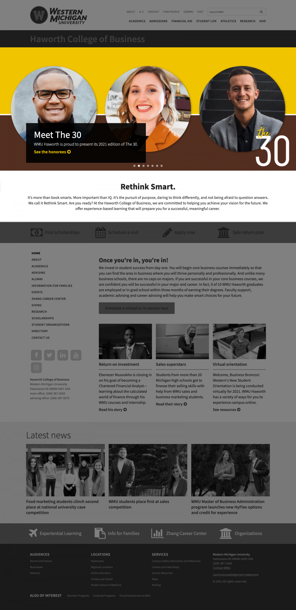
Upon creating a new flexible page, you will discover that a flexible page consists of four regions into which you will be adding a variety of components.
Hero region
Content placed in the hero region is displayed below the WMU header and the section name banner, but above all other regions and the section menu. Use of this region plays a role in determining the <h1> on the page. The region can consist of one cover image, image, image with call to action, slideshow or video, optionally followed by text to be used as a lead paragraph. If there is no content in the Content region, the page title and lead text of the the Hero region will appear to be at the top of Region 2.
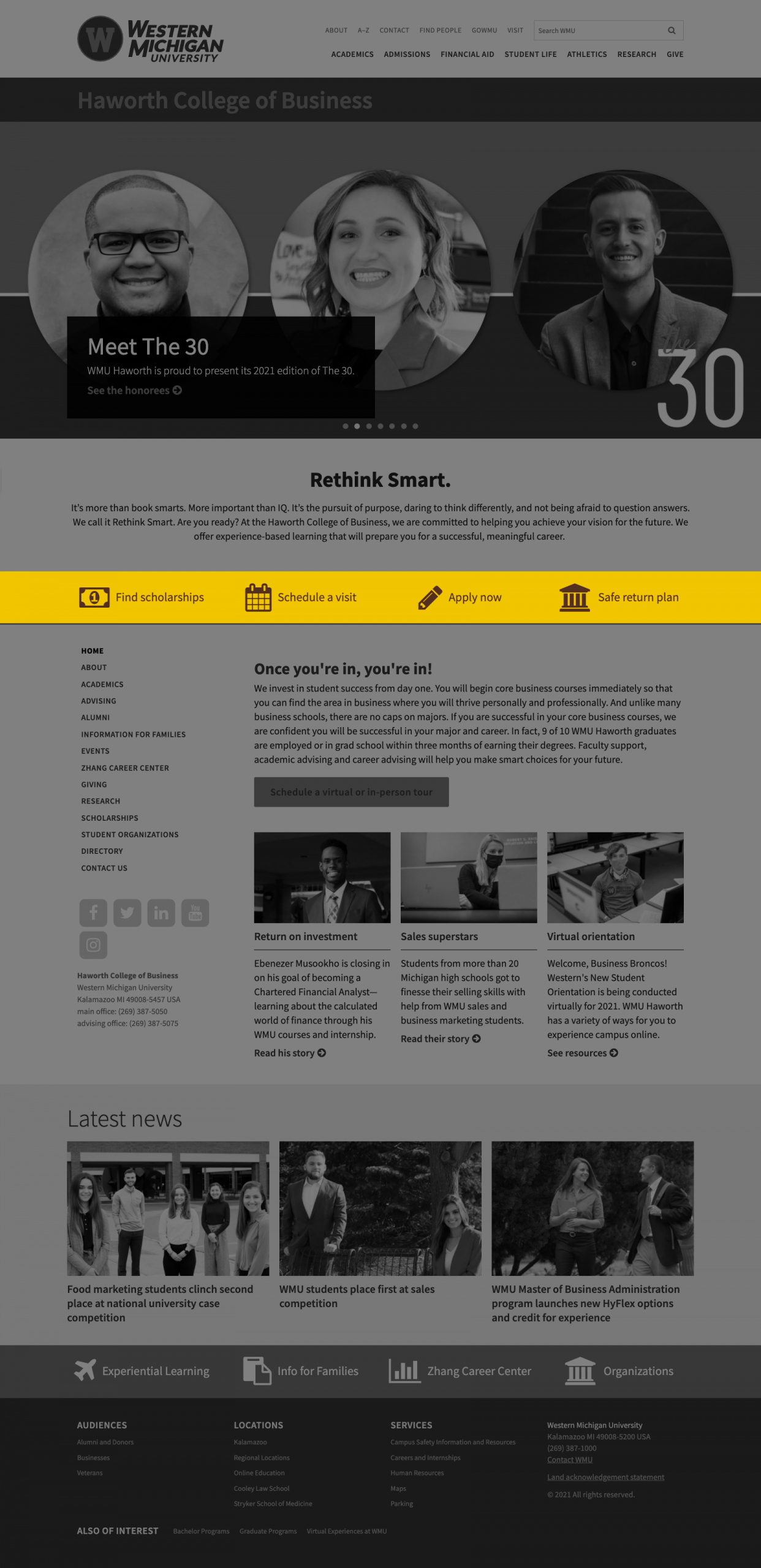
Content
Like the hero region, the Content region occurs before the section menu. Unlike the hero region however, this region plays no role in determining the <h1> on the page. There are also quite a few more components that can be placed in the content region.
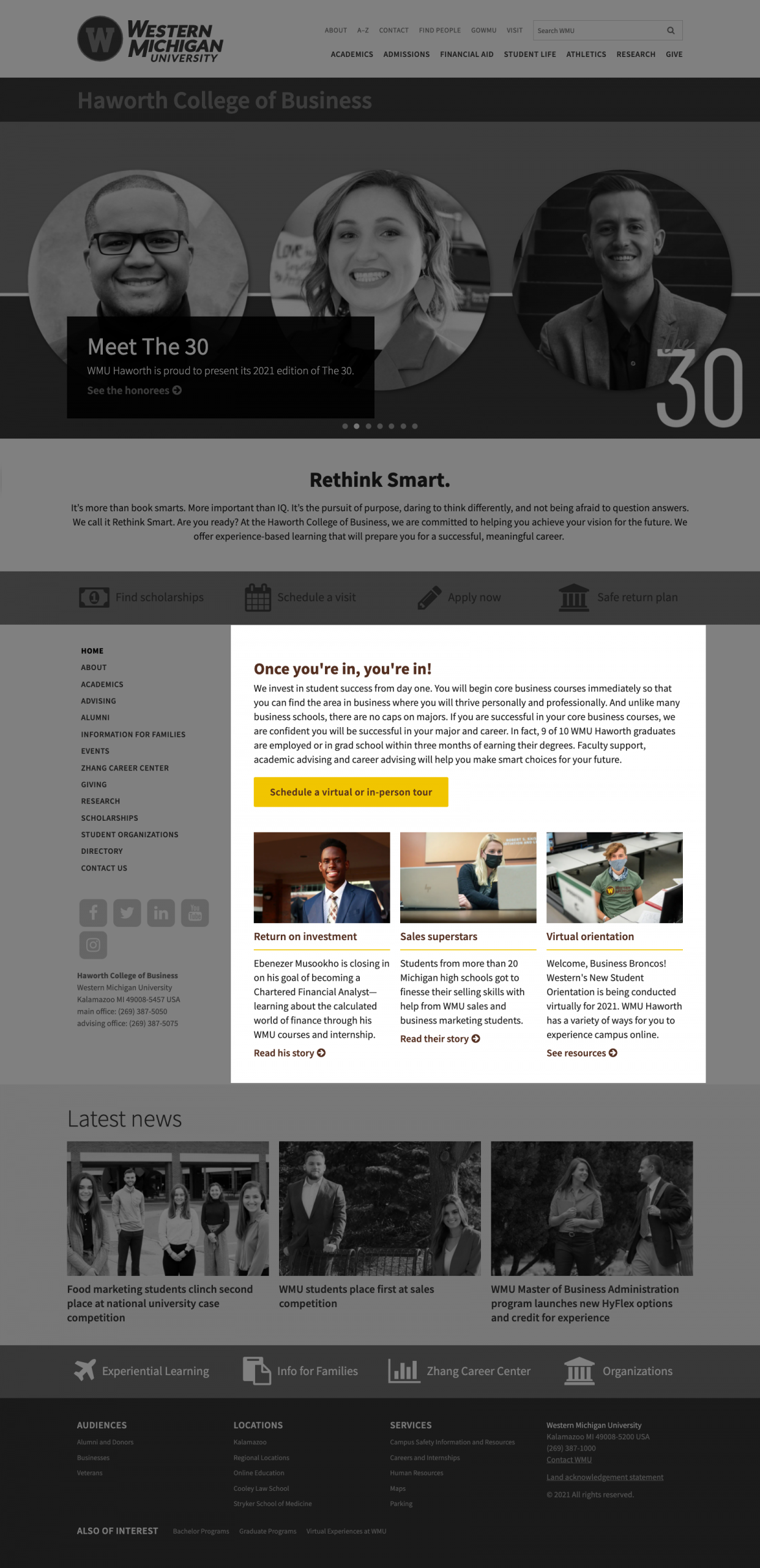
Region 2
Allowing most of the same components as the Content region, Region 2 is placed beside the section menu. Thus, where the other regions span the full width of the page, Region 2 spans only 75% of the width.
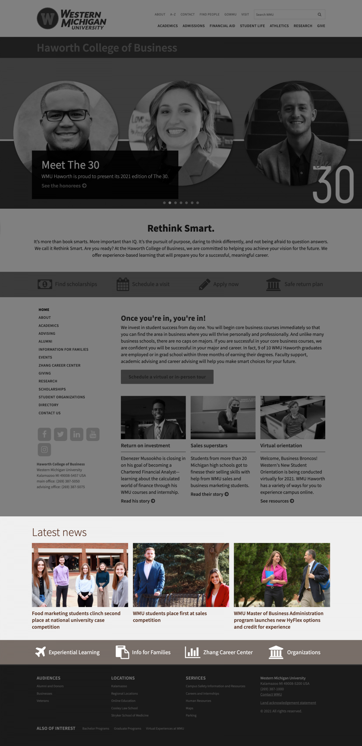
Region 3
Region 3 allows for the same list of components available in the content region. This region is displayed below the section menu and Region 2, ending just above the WMU footer.

Hero region

Content region

Region 2

Region 3
Components
Accordion and Accordion panel—allow content to be placed inside panels that can be expanded and collapsed.
Article grid—facilitate placing a grid of CMS news articles on a flexible page.
Calendar and Event list—allow upcoming events to be easily added to a flexible page.
Call to action—allows text accompanied by one or two buttons to be added to the page.
Component grid—allows some other components to be added and arranged into a grid of various sizes on the page.
Icon button—allows a button with an icon and text to be added to a Component grid.
Image card—allows an image with accompanying text and link to be added to a Component grid using the appropriate markup.
Text card—allow stylized textual infographics, statistics or quotes to be added to Component grids.
Video card—allow videos to be embedded in a Component grid.
Container—allow you to functionally separate components on the page by providing a heading and background color for the components contained within.
Cover image—allows a more banner-like, full-width image with a wider aspect ratio to be added to the page.
Image and Image with call to action—allows full-width images to be added to the page with captions that have improved visibility and control of placement.
Links—allows a list of links with an optional heading to be added to the page.
Slideshow—allow multiple Image components to be cycled between in the space occupied by one Image component.
Snippet—allows approved third party or custom snippets of code to be added to the page.
Text—allow rich text containing filtered HTML elements to be added to the page using a WYSIWYG editor.
Two column split—allows other components to be arranged in two side-by-side columns.
Video—allows full-width video to be added to the page with options for autoplay and text overlay.

